Flexbox and Templating
Resources:
- Flexbox
- https://css-tricks.com/snippets/css/a-guide-to-flexbox/
- Templating
- https://1sherlynn.medium.com/
Flexbox CSS
The Flexbox Layout (Flexible Box) module aims at providing a more efficient way to lay out, align and distribute space among items in a container, even when their size is unknown and/or dynamic.
Properties for the Parent Element:
display: flex- defines a flex container (used on parent container)
- enables a flex context for all its direct children
flex-direction- establishes the main-axis, thus defining the direction flex items are placed in the flex container.
row (default)/row-reverse/column/column-reverse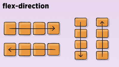
flex-wrap- allow the items to wrap as needed
nowrap/wrap/wrap-reverse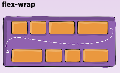
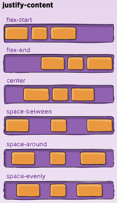
justify-content- defines the alignment along the main axis.
flex-start/flex-end/center/space-between/space-around/space-evenly/start/end/left- safest values are flex-start, flex-end, and center.
align-items- defines the default behavior for how flex items are laid out along the cross axis on the current line.
stretch/flex-start/flex-end/center/baseline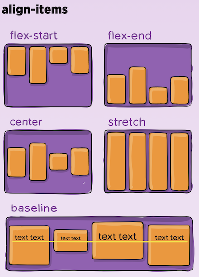
align-content- aligns a flex container’s lines within when there is extra space in the cross-axis
- This property only takes effect on multi-line flexible container
flex-start/flex-end/center/space-between/space-around/space-evenly/stretch/start/end/baseline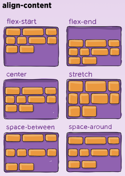
Properties for the Children Elements:
order- controls the order in which flex items appear in the flex container.
order: 5; /* default is 0 */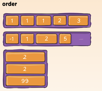
flex-grow- defines the ability for a flex item to grow if necessary.
flex-grow: 4; /* default 0 */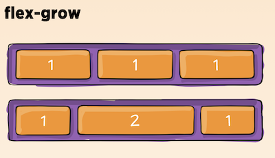
flex-shrink- defines the ability for a flex item to shrink if necessary.
flex-shrink: 3; /* default 1 */
flex-basis- defines the default size of an element before the remaining space is distributed.
- can be a length (e.g. 20%, 5rem, etc.) or a keyword.
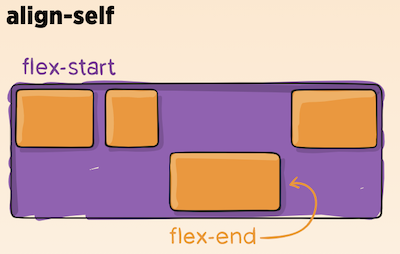
align-self- allows the default alignment (or the one specified by align-items) to be overridden for individual flex items.
Javascript Templating
Javascript templating is a fast and efficient technique to render client-side view templates with Javascript by using a JSON data source. The template is HTML markup, with added templating tags that will either insert variables or run programming logic.
Mustache
Mustache is a logic-less template syntax. It can be used for HTML, config files, source code — anything. It works by expanding tags in a template using values provided in a hash or object.
- There are no if statements, else clauses, or for loops.
- There are only tags. Some tags are replaced with a value, some nothing, and others a series of values.